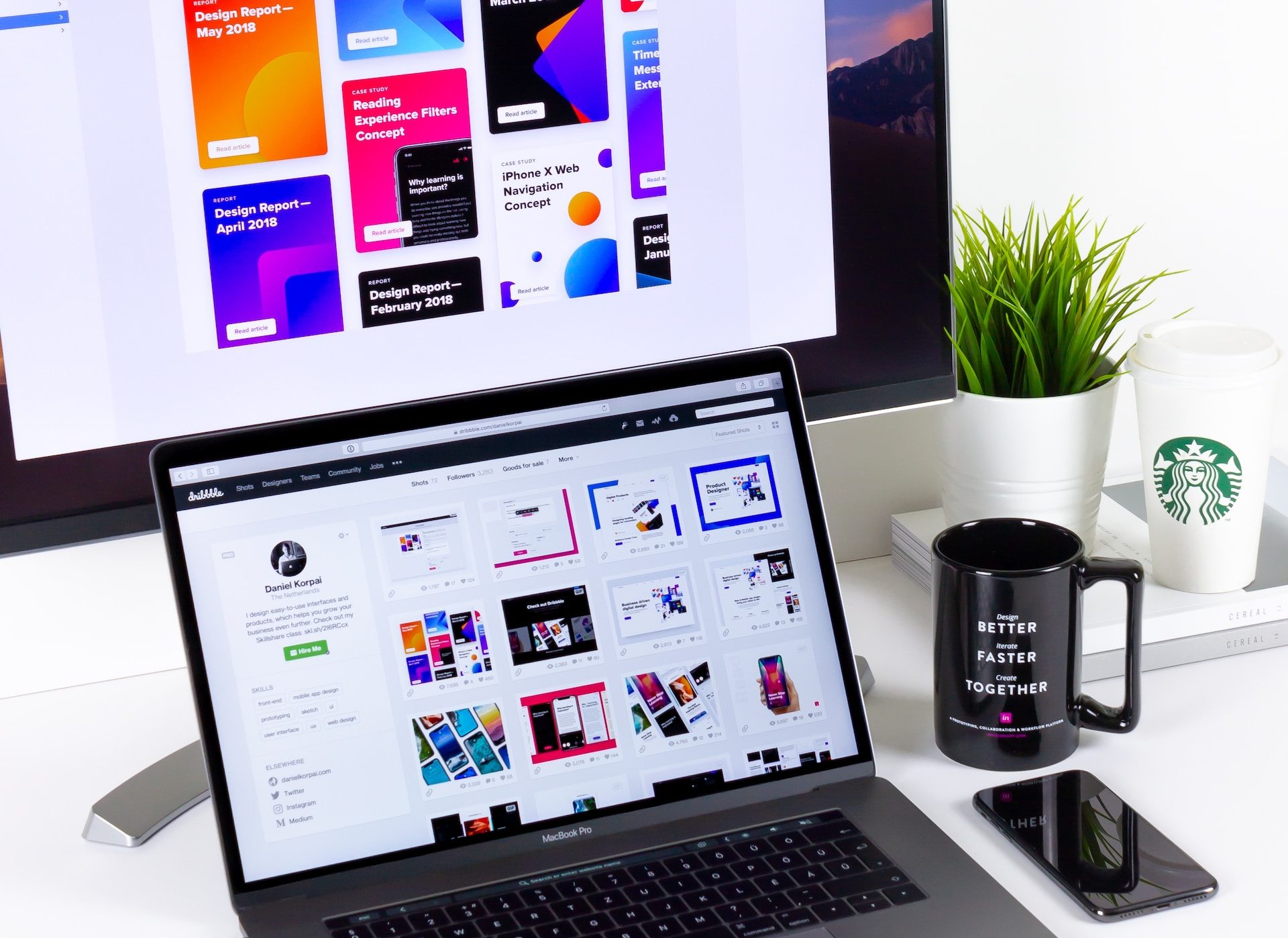
Typography is an essential component of graphic design, with the ability to increase visual communication and elicit emotions. When dealing with typography, even expert designers can make blunders. In this article, we will look at the most common typography mistakes in graphic design and offer practical solutions for avoiding them. By avoiding these problems, you may improve the quality of your designs while also ensuring effective communication with your audience.
1.Font Overload
Using too many fonts in a design is a typical error that can result in visual chaos and confusion. Limit your font selection to two or three typefaces that complement each other and are consistent with the objective and aesthetic of the design. To keep a consistent look, select typefaces that establish a unified visual identity and use them consistently across your design.
Tip: Create a typography style guide for your project, specifying the fonts, sizes, and weights to be used in various design elements.
2.Poor Font Pairing
Mismatched or mismatched font combinations might detract from your design’s overall beauty and readability. Consider contrast, harmony, and compatibility when matching fonts. Combining a serif and a sans-serif font or utilizing different weights within the same typeface family can create contrast. Experiment with alternative pairings and solicit feedback to ensure your choices are aesthetically appealing and effectively deliver the intended message.
Tip: Use online resources and tools that offer font pairing suggestions to assist you in finding harmonious combinations.
3.Lack of Hierarchy
A typical issue is failing to develop a clear visual hierarchy, which causes confusion and makes it difficult for users to prioritize information. Use font size, weight, and style variations to direct the viewer’s attention and highlight crucial elements. Headlines, subheadings, and body text should all have identifiable features that help to create order and make the design more scannable and readable.
Tip: Sketch out a hierarchy plan before diving into the design process, identifying the primary and secondary elements that require visual prominence.
4. Inconsistent Typography
Inconsistency in font across design elements, platforms, and marketing collateral can undermine brand identity and confuse your audience. Create and stick to a consistent typeface scheme throughout your design work. Using the same typefaces, font sizes, spacing, and alignment across several touchpoints ensures a coherent and cohesive visual language.
Tip: Create a brand style guide that includes specific guidelines for typography, enabling you and others to maintain consistency in all design materials.
5. Neglecting Readability
Prioritizing aesthetics over readability is a big mistake that will hinder your design’s efficacy. Avoid employing too ornamental or complicated fonts that detract from legibility. Consider the context in which your design will be viewed, whether in print or digital form, and choose typefaces, sizes, and styles that are easy for your target audience to read.
Tip: Test the legibility of your typography by seeking feedback from different individuals and considering their perspectives.
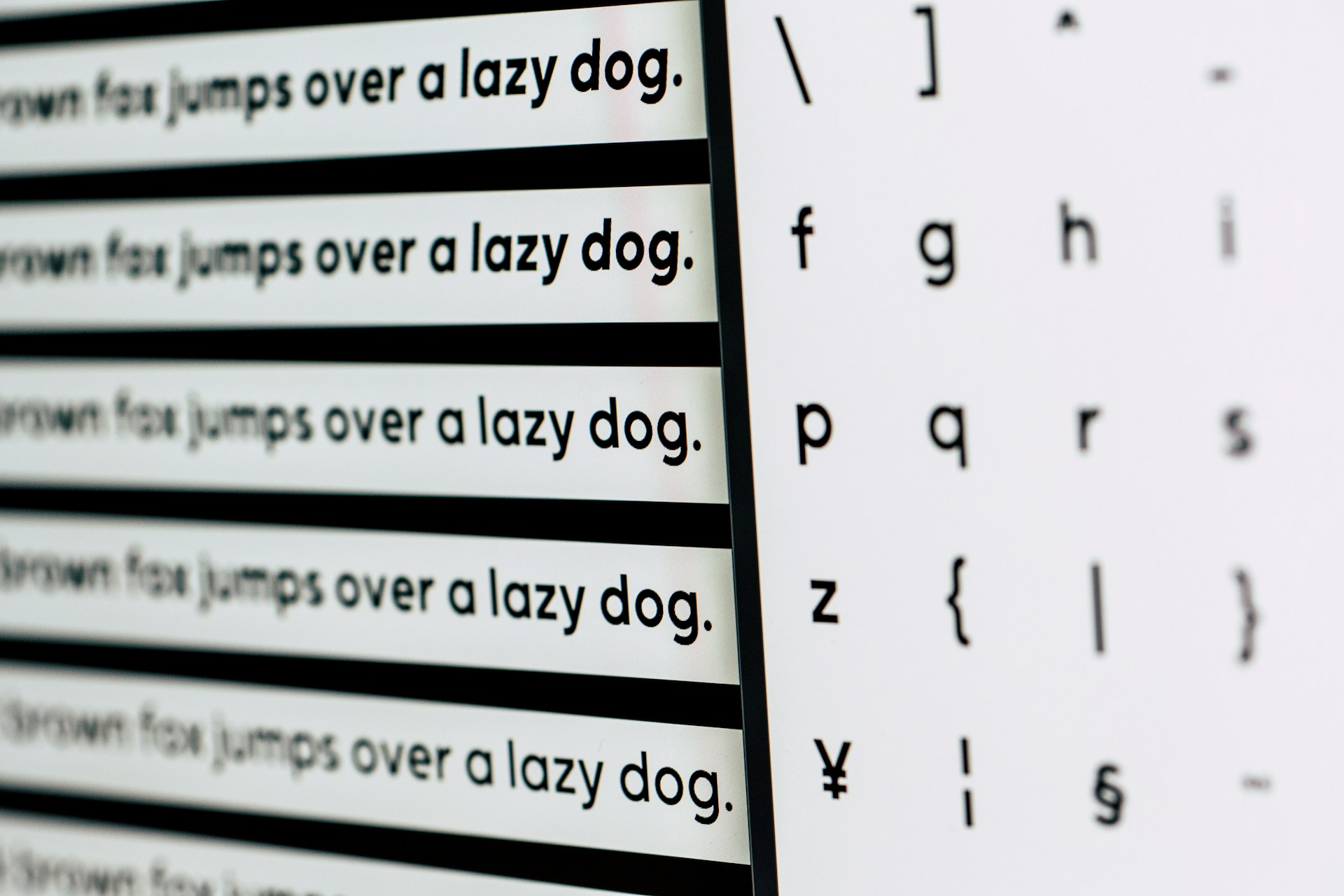
6. Improper Kerning and Leading
Failure to use adequate letter spacing (kerning) and line spacing (leading) can have a severe influence on the readability and aesthetics of your typography. To avoid letters that are overly tightly or loosely spaced, pay attention to the spacing of individual characters. Adjust the leading to achieve a comfortable and visually appealing line height, making sure that the text lines are neither too packed or too widely separated.
Tip: Zoom in and review your typography at a larger scale to spot any kerning or leading issues that might be less noticeable at a smaller size.
7. Disregarding Alignment
Poor text alignment might make your design appear sloppy and disorganized. Ensure that your typography is always aligned to a grid or baseline, resulting in an aesthetically appealing and well-organized layout. Alignment improves readability and creates aesthetic harmony in your design.
8. Lack of Contrast
Inadequate contrast between text and backdrop colors is a common error that can impair legibility. Make sure there is enough contrast to make the writing legible. Consider the color pallet and choose color combinations that create enough difference. To ensure readability in multiple environments, test your design in different lighting conditions.
9. Ignoring Context and Medium
A typical mistake is failing to consider the context and medium in which your design will be viewed. Typography that works well in print may not function well on digital platforms, and vice versa. Consider screen resolutions, responsive design, and the limits of different mediums when making typographic decisions.
10. Lack of Proofreading
Ignoring proofreading can result in unsightly typographical errors in your finished design. Proofread your material attentively, looking for spelling and grammatical flaws, as well as inconsistencies. A single error can harm your design’s professionalism and credibility.
By becoming familiar with these most common typography mistakes and applying the suggestions, you can avoid the difficulties that many graphic designers face. Typography is a powerful design tool, and by utilizing it deliberately and correctly, you can increase the visual impact and efficacy of your designs, ensuring that your message is presented accurately and aesthetically.