What is Typeface?
At its core, a typeface, also known as a font family, is a design style that comprises a variety of weights, sizes, and styles of a set of characters. It includes letters, numbers, punctuation marks, and occasionally, special characters. The term ‘typeface’ predates the digital age and originates from the days when printed materials were created using metal types.
The shape, proportion, and design of a typeface determine the ‘face’ given to a text. Essentially, it refers to how text looks in terms of design. From Serif to Sans-serif, Slab-serif to Monospaced, Script to Decorative, there are many types of typefaces, each offering a unique feel and aesthetic appeal.
Typefaces greatly influence the reader’s perception and can instill a specific tone or mood to printed or visual content. For instance, a Serif typeface may communicate elegance and tradition, while a Sans-serif typeface might relay a sense of modernity and minimalism. Designers use typefaces to create a visual hierarchy, improve readability, and enhance the overall user experience.
What is Font?
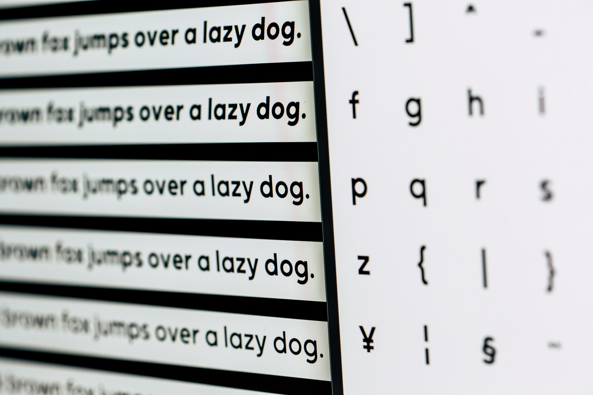
A font is a specific variation within a typeface. It refers to the weight, width, size, orientation, spacing, and other stylistic features of a set of characters within a typeface. The term ‘font’ has its roots in the traditional printing era, where it referred to a specific size and style of a typeface in a printer’s collection.
For instance, within the Helvetica typeface, the versions Helvetica Light, Helvetica Regular, Helvetica Bold, and Helvetica Italic are all different fonts. Each font caters to a particular need and purpose in the design. The right font creates an appropriate reading rhythm and influences the viewers’ mood and perception, just like a typeface does.
Fonts are essential tools for designers. They play a cardinal role in constructing visual narratives, highlighting crucial information, adding charm to the design, and making the content accessible and legible. Designing with the right font can capture and retain the viewer’s attention, enhancing the overall visual aesthetic of the design.
Key difference between Font and Typeface
While often used interchangeably, font and typeface are not the same. Their key difference between Font and Typeface lie in their definitions and their usage in design. Recognition of these nuances can benefit designers in building effective and visually appealing designs.
A typeface is a design style of a collection of characters with similar features, while a font is a specific variation within that typeface. In simple terms, a typeface is what you see (e.g., Helvetica), while a font is what you use (e.g., Helvetica Bold Italic). Thus, a typeface encompasses a collection of fonts.
Another point of difference is in relation to the mood or tone they convey. Both can set the tone for your design, but with different subtleties. Smashing Magazine points out that while a typeface can evoke a broad feeling (like modernity with a Sans-serif typeface), a font can fine-tune that feeling with its weight and style (like modernity with a sense of stability using Helvetica Bold).
Recognizing these differences plays a crucial role in creative processes. Being precise with terminology can streamline communication within a design team, as well as with clients, making sure everyone understands exactly what is being discussed. Understanding the nuanced impacts of different typefaces and fonts allows designers to create designs with intentional and effective visual storytelling.
Common Misconceptions about Typeface and Font
The terms ‘typeface’ and ‘font’ are frequently confused, leading to several misconceptions. One primary misunderstanding is the belief that these two terms are interchangeable. The reasons for this misconception can be attributed to the digital age, where font selection in computer applications is actually choosing a typeface.
Another common misconception is that fonts and typefaces are the same because they look similar. This is not true; a typeface represents a family of fonts. For example, Arial is a typeface, not a font. But Arial Bold and Arial Italic are different fonts within the Arial typeface.
Some believe that all fonts convey the same visual aesthetics and tones, regardless of their style and weight. However, each font within a typeface can significantly influence the reader’s perception, mood, and reading experience. Even a simple alteration from regular to italic or bold can dramatically alter the message and tone of a design.
By understanding the correct definitions and roles of typefaces and fonts, we can avoid these misconceptions, thereby streamlining the design process, improving communication within design teams, and enhancing the quality of the designs.
Examples of Fonts and Typefaces
To further understand fonts and typefaces and their usage in design, let’s examine a few examples:
- Typeface: Serif – Serif typefaces, such as Times New Roman or Georgia, are characterized by a small line or stroke regularly attached to the end of a larger stroke in a letter or symbol. Commonly used in print, Serif fonts give a classic, trustworthy, and professional feel.
- Font: Times New Roman Bold – This is a font within the Times New Roman typeface. The ‘Bold’ variation adds emphasis and is often used to highlight important information or create contrast in a design.
- Typeface: Sans-serif – Sans-serif typefaces, like Arial or Helvetica, lack the small line at the end of strokes. These typefaces are often used in digital content and give a modern, clean, and minimalist feel.
- Font: Arial Italic – This is a font within the Arial typeface. The ‘Italic’ variation implies a sense of emphasis or importance, change of tone or voice, or a thematic shift.
Understanding the characteristics of different typefaces and fonts and knowing how to use them effectively can drastically enhance the visual appeal and readability of a design. Designers can use these tools to influence a reader’s perception and emotion, guide their attention, or portray a specific mood or tone.
Conclusion
In summary, while the terms ‘font’ and ‘typeface’ are often used interchangeably in everyday language, they signify distinct concepts in the realm of design. A typeface refers to the collective design features of a set of characters, whereas a font represents a specific variant within a typeface. The terms originate from the early days of letterpress printing, but their meanings have evolved within the digital age.
Understanding the difference between font and typeface is vital not only for those involved in design but also for everyone engaging with digital content. Recognizing this difference can fine-tune the content creation process, enrich communication within a team or with clients, enhance design aesthetics, and contribute to impactful visual storytelling.
By clearing up common misconceptions and demonstrating how to use fonts and typefaces effectively through examples, we hope this blog post has provided the insights needed to appreciate and navigate the vast landscape of typography.