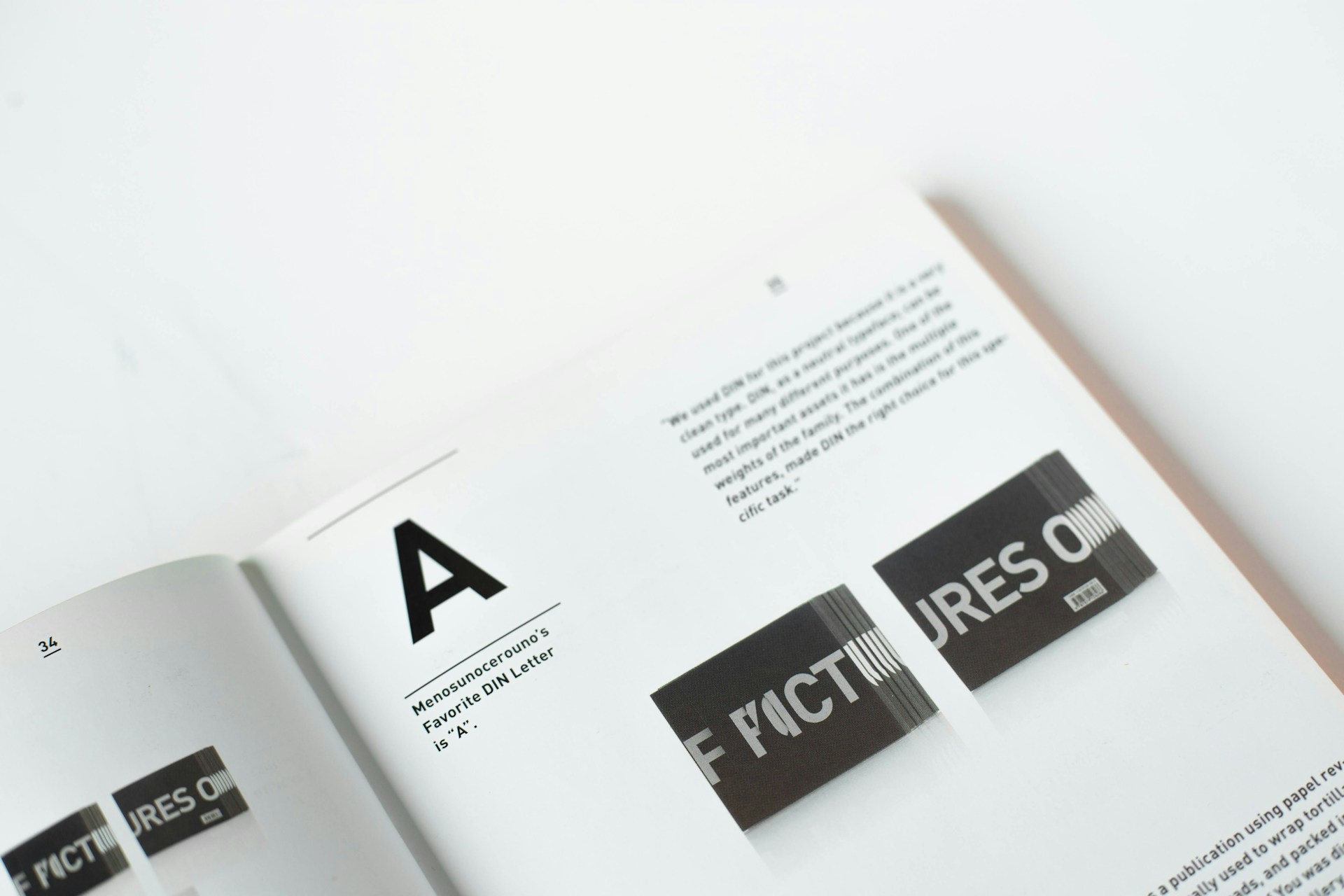
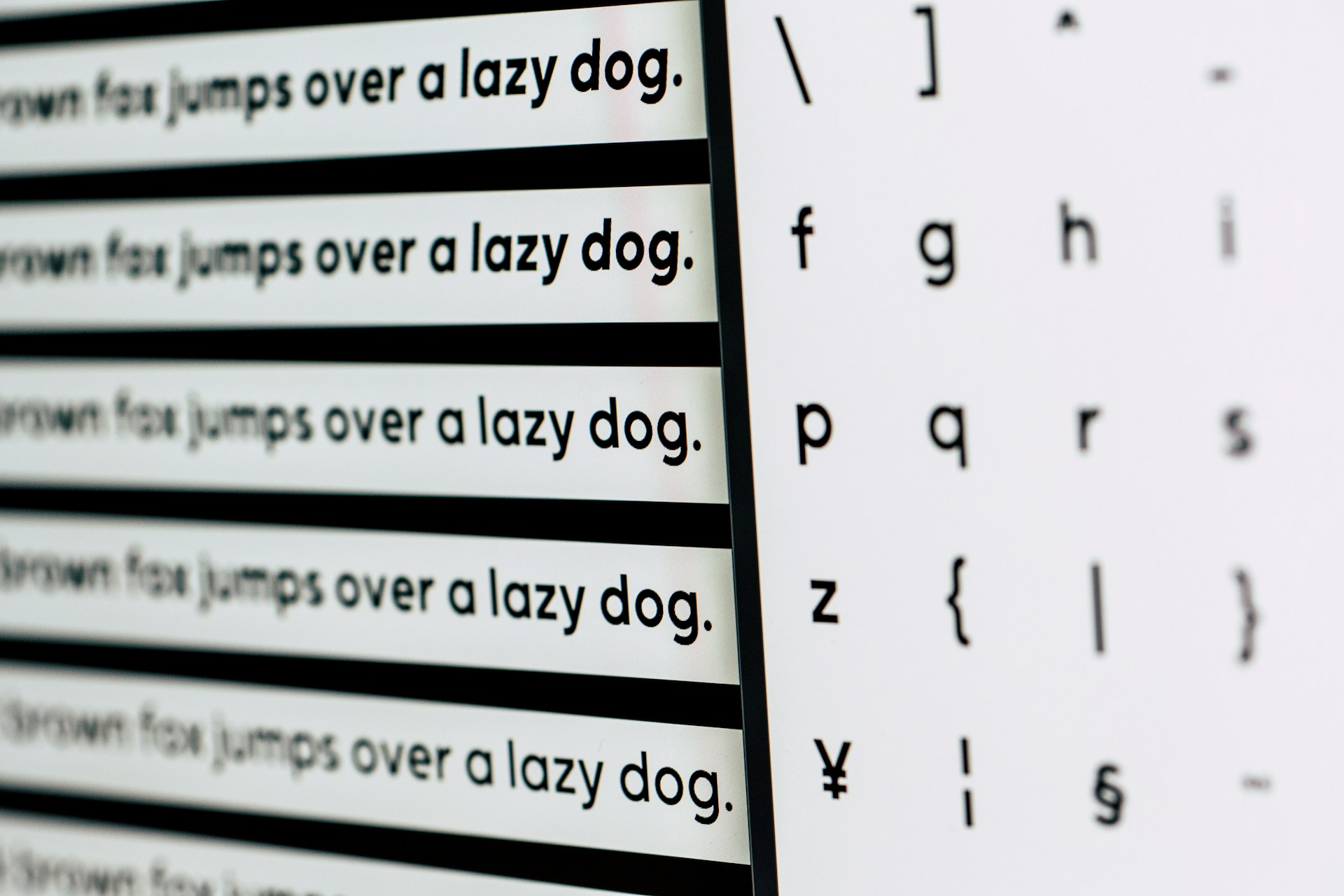
Fonts, also known as typefaces, play a major role in design and communication. They are more than just a stylistic choice; the fonts you choose can carry a multitude of meanings, feelings, and connotations. They directly impact how your message is perceived by the viewer. It is essential to understand the different ‘Types of Fonts’ and how best to use them to enhance communication through design.
Understanding the basics of fonts
In the field of visual communication, knowing the fundamentals of fonts is essential. Part of this is typography, the art of type arrangement. The way text appears visually is affected by it. Every typeface has multiple parts, and they all work together to express the desired mood or message.
A font’s typeface is its most important part. It specifies the style and look of the characters. Every typeface has its own unique vibe, and designers pick them according to the impression they want to convey.
Another factor is the point size, which denotes the font size. It is critical to check that the point size works well with the design and serves its intended purpose. Lastly, a font’s style is the collection of customizable features like bold, italic, underline, etc.
The effectiveness and clarity of the conveyed information can be greatly affected by the choice of typeface. Discover the font’s inner workings and how they enhance visual communication and design.
The different types of fonts
The world of typography houses a plethora of fonts, but primarily they can be categorized into five types:
- Serif Fonts– These fonts have tiny lines or strokes attached to the end of larger strokes in a letter or symbol. Known for their traditional and classic feel, serif fonts are often used in print, books, and magazines. Examples of this type include Times New Roman and Georgia.
- Sans Serif Fonts– Sans serif, literally meaning ‘without serif’, are fonts that lack the tiny strokes at the end of the letters. They present a modern, clean, and minimalist aesthetic. They are commonly used in digital design and headings. Arial and Helvetica are popular examples of sans-serif fonts.
- Script Fonts– Script fonts are typefaces with a personal, handwritten feel. They are usually used sparingly for emphasis, such as in invitations or headers. Examples include Brush Script and Allura.
- Display Fonts– Also known as decorative fonts, display fonts are primarily used for headings or titles due to their unique and eye-catching nature. They might not be suitable for body text as their distinctiveness can hinder readability. Examples include Impact and Algerian.
- Monospace Fonts– In monospace fonts, every character occupies the same amount of horizontal space. These fonts are typically used in coding or tabular data. Courier and Consolas are common monospace fonts.
Each of these font types has unique characteristics and is preferred for different use-cases, based on their features.
Choosing the right types of fonts for your project
Selecting the right font for your project is imperative as it directly impacts the perception and comprehension of your message. Here are a few important considerations to keep in mind:
- Readability: Regardless of how attractive your chosen font might be, if it is not easily readable, it defeats its purpose. Prioritize readability when choosing a font for your body text. Both serif and sans serif fonts can be excellent choices for this purpose.
- Mood: Each font has a unique vibe or mood. Some might be casual and friendly, while others could be formal and serious. Ensure that the mood of your font aligns with the tone of your message.
- Brand Consistency: The font you choose must align with the brand’s personality. It should echo the imagery, color palette, and overall mood of the brand to ensure a consistent and memorable brand identity.
Lastly, consider the medium of communication. The screen displays fonts differently than print does, which might impact the overall appearance of your text. Experiment, test but most importantly, use your discretion to decide the ideal font for your project.
How to use fonts effectively
The following tips will guide you on how to use fonts effectively in your design:
- Font Pairing: Selecting two or more different fonts that complement each other can create an appealing contrast in your design. Ensure that the chosen fonts belong to different families, yet harmoniously work together without clashing.
- Hierarchy: Introducing hierarchy in typography helps guide the reader’s eye towards important pieces of information. You can establish hierarchy by using different font sizes, weights, and styles for different elements such as headings, sub-headings, and body text.
- Contrast: Contrasting typefaces can make your design more interesting and dynamic. A common way to achieve contrast is by using serif fonts for headings and sans serif fonts for body text, or vice versa.
- Consistency: While it’s great to experiment with different fonts, maintaining consistency in the regular use of fonts helps create a professional and cohesive look. So, try to stick to a select few fonts throughout your design.
Remember, mastering the art of using fonts effectively can make your design stand out for the right reasons.
Common mistakes to avoid when using fonts
Here are some common mistakes that people often make when using fonts and how to avoid them:
- Using Too Many Different types of Fonts: More often than not, using too many different fonts can confuse the reader and disrupt the flow of the text. Stick to a maximum of three different fonts in your design for a clean, professional look.
- Ignoring Readability: While visually engaging fonts might look appealing, if they are hard to read, they will only detract from your message. Always prioritize readability, especially in longer blocks of text.
- Not Aligning the Font with the Brand or Message: Fonts play a big role in conveying the personality of your brand or the tone of your message. Inappropriate font choices can communicate the wrong message to the audience. Always ensure that the font aligns with the aesthetics and values of your brand or message.
Making informed choices about typography can considerably elevate the effectiveness of your design. Take a look at this article on typography mistakes to avoid for more insights.
Final thoughts
An essential aspect of good design and communication is knowing types of fonts and how to use them properly. Our message’s interpretation is heavily influenced by the font type and its usage. For this reason, it is critical to master the various typefaces and their applications in order to create eye-catching designs and persuasive messages.
The aforementioned facts may lay the groundwork, but there is a lot more to the world of fonts than this. Learning and experimentation are crucial in the dynamic domain of design. Hence, you can achieve genuinely captivating outcomes by consistently investigating various fonts, their effects, and experimenting with their optimal application in your specific setting.
If you want to grow as a designer, you have to be willing to make mistakes and then learn from them.


