In the ever-changing world of eCommerce, staying updated with the latest trends is crucial for online businesses to remain competitive. With advancements in technology, a drastic transformation in design aesthetics, and evolving shopper preferences, eCommerce design trends are not what they were just a few years back.
- Immersive Web Animations
- Interactive Product Visuals
- Multidirectional Layouts
- Creative Page Transitions
- Vaporwave Aesthetics
- Neutral & Pastel Colors
- Attractive Typography With Contrast Colors
- Mobile-First Design Approach
- Catchy Product Page
- Page Hybrids
- AI & Chatbots Features
- Storytelling Approach for Product Pages
- Unconventional Page Filters
- Conclusion
As we approach the year 2024, eCommerce entrepreneurs and web designers need to look ahead and prepare for the emerging trends that would rule the digital shopping world. It’s time to peer into the crystal ball and envision how future eCommerce platforms would look, perform, and deliver unparalleled user experience. This article will take you on a futuristic journey, exploring the eCommerce design trends that are expected to dominate in 2024.
Immersive Web Animations
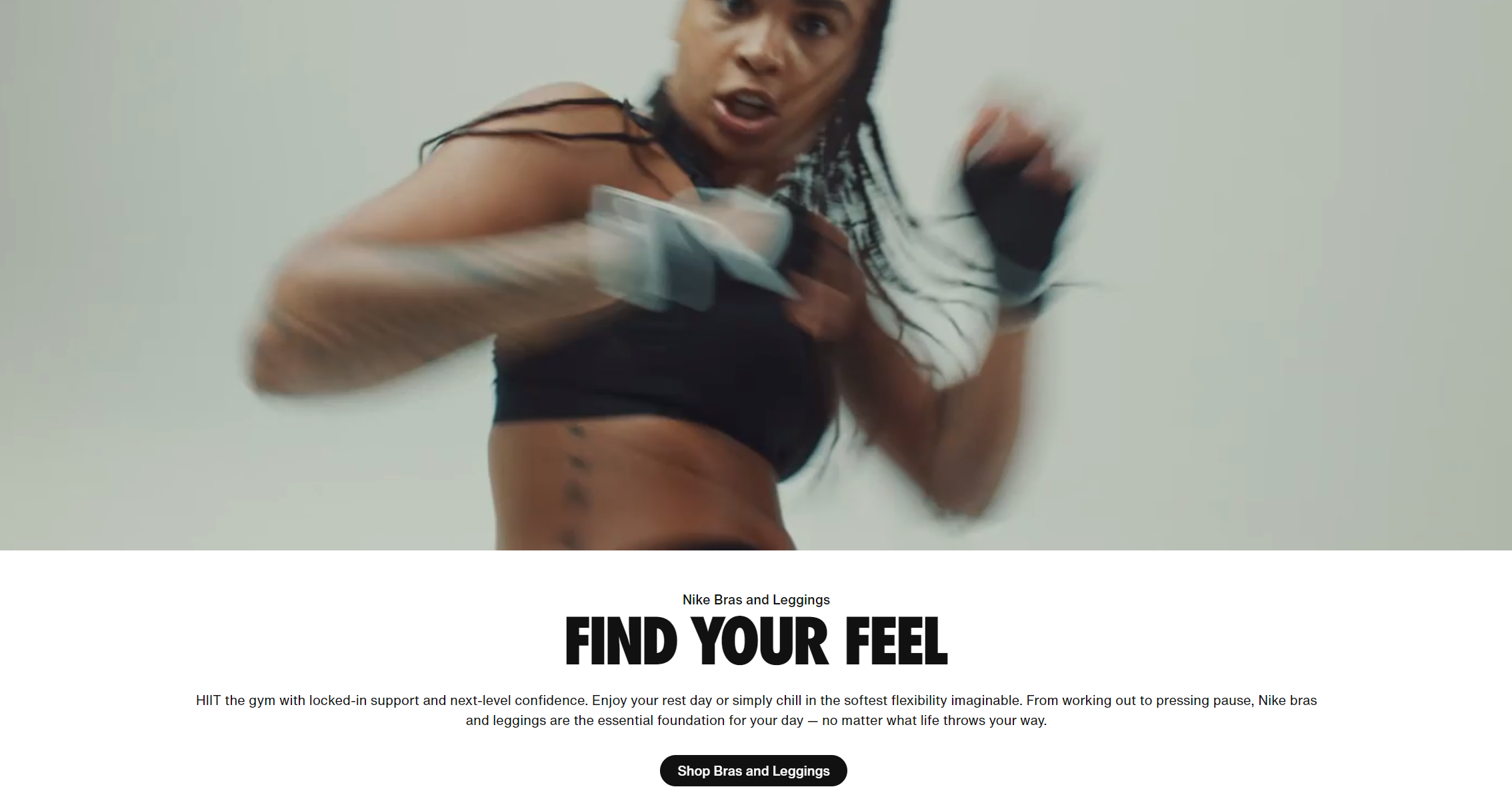
First up on our list of future eCommerce design trends is Immersive Web Animations. Dynamic and intuitive, animations have always been an effective way to engage users, tell a story and create a memorable browsing experience. However, as online shoppers become more discerning and tech-savvy, the role of animations in eCommerce websites is changing and becoming more sophisticated than ever.
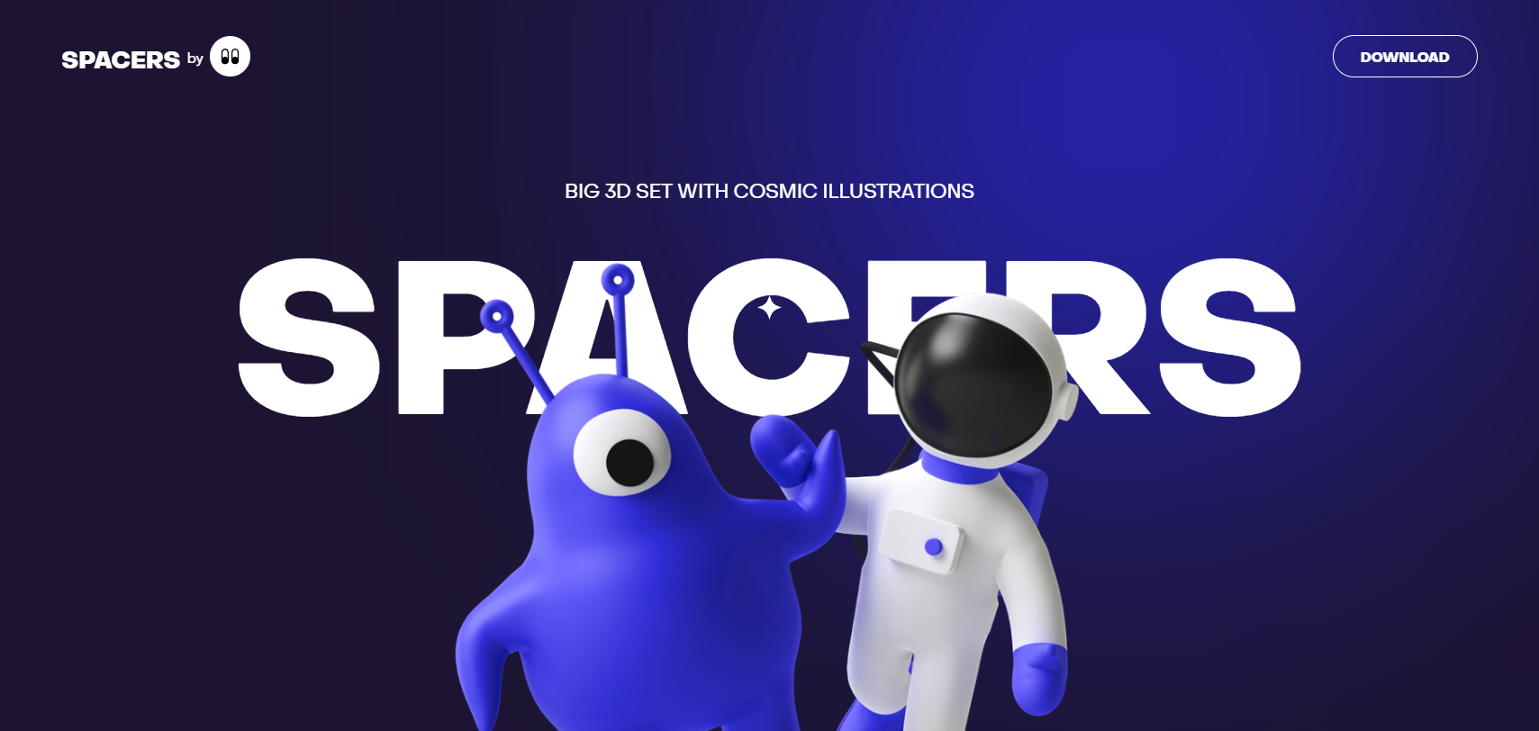
In 2024, we predict a surge in the use of ‘Immersive Web Animations’ that are not just visually pleasing but also interactive, personalized and seamlessly integrated into the overall website design. By making the users an integral part of the story, these design elements can trick the human brain into a state of enhanced imagination and emotional engagement, thus elevating the overall shopping experience.
Brands like Apple and Nike have already successfully incorporated immersive animations in their online stores. By 2024, we anticipate more brands harnessing the power of advanced animation technologies to attract, engage and retain online shoppers.
Interactive Product Visuals
Visuals have always played a significant role in eCommerce. High-quality photos and videos are essential for showcasing products effectively. However, in 2024, we predict a shift towards more ‘Interactive Product Visuals.’ These dynamic visuals allow users to engage with the product images more interactively, giving them a better sense of the product before making a purchase decision.
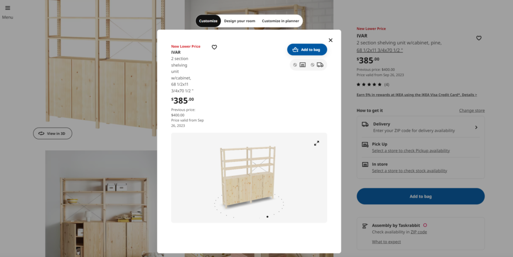
For instance, interactive 360-degree view images, virtual try-ons, and augmented reality (AR) implementations give online shoppers a richer, more tactile shopping experience. Such visuals not only improve product presentation, but they also help to build trust, as shoppers can explore the product from multiple angles and get a better idea of what they are buying.
Brands like Ray-Ban and IKEA have already started utilizing interactive product visuals, and by 2024, we can expect this trend to become mainstream. This eCommerce design trend has the potential to boost sales, reduce returns, and improve customer satisfaction.
Multidirectional Layouts
Web design has traditionally adhered to grid formats, with users scrolling vertically to access content. However, as users become more familiar with digital interfaces, their navigational habits are evolving. Enter: ‘Multidirectional Layouts.’
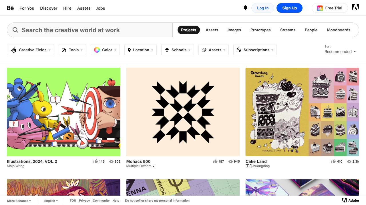
This trend implies designing layouts where users can navigate horizontally, vertically, and even diagonally. Such layouts offer a more immersive and interactive browsing experience, provide a break from the monotony of vertical scrolling, and make the experience feel more like a journey.
Examples of multidirectional layouts include card designs where each card can be any size and serves as a doorway into a different part of the site, creating a rich tapestry of information. In 2024, we predict eCommerce websites will employ multidirectional layouts to enhance user navigation and engagement.
With a growing focus on user experience, multidirectional layouts bring dynamism and adaptability in website design, leading to more functional, engaging, and aesthetically pleasing eCommerce sites.
Creative Page Transitions
One of the key aspects of a website that influences user engagement is its page transitions. A sudden cut from one webpage to another can sometimes feel abrupt and cause a disturbance in the user’s browsing flow. This is where ‘Creative Page Transitions’ come in.
By using state-of-the-art coding practices and animation techniques, web designers can create fluid, smooth, and visually pleasing transitional effects from one webpage to another. These effects not only make the website appear more dynamic and engaging but also add a touch of elegance and refinement to the overall design.
This could mean a smooth dissolve effect as one page fades out and the next one fades in, or a swooping slide transition where the new page appears to slide over the old one. In 2024, anticipate an increased focus on creative page transitions in eCommerce design.
Emphasizing user experience and engagement, creative page transitions can ultimately lead to lower bounce rates, higher engagement rates, and improved conversion rates.
Vaporwave Aesthetics
When it comes to design aesthetics, predictions can be tricky. However, one trend that has been gaining traction and is expected to go mainstream by 2024 is ‘Vaporwave Aesthetics.’
Vaporwave is a micro-genre of art and music that emerged on the internet in the early 2010s. Rooted in nostalgia for ’80s and ’90s pop culture, Vaporwave often uses pastel colors, computer-generated environments, and retro-futuristic iconography to create surreal, dreamlike landscapes.
Translating this aesthetic into eCommerce design, we can expect to see websites that fuse modern design principles with nostalgic elements. This trend can give an eCommerce website a distinctive look and feel, making it more memorable for users.
While the impact of Vaporwave aesthetics on user experience needs further study, it’s safe to assume that it can help in creating a unique brand identity and differentiate an eCommerce website in the crowded digital marketplace.
Neutral & Pastel Colors
The color scheme of an eCommerce website is a critical aspect of its overall design aesthetics. The colors used can greatly influence how a user feels about your website and indirectly about your brand. In 2024, we predict the growth of ‘Neutral & Pastel Colors’ trend in eCommerce design.
Neutral colors such as whites, greys, and blacks, and pastel colors like soft pink, baby blue, lavender, and mint green are expected to dominate the eCommerce landscape. These colors are easy on the eyes and create a sense of calming elegance, cleanliness, and modernity.
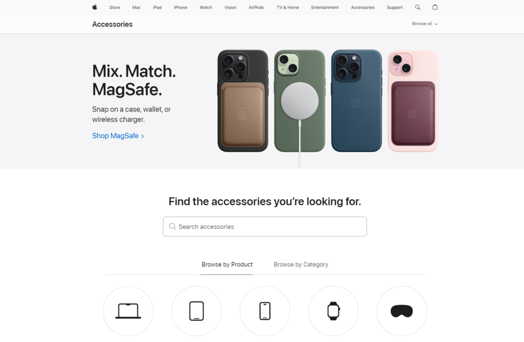
By adding a touch of sophistication and tranquility, neutral and pastel colors can enhance the user experience by making the browsing process more comfortable and pleasant. Furthermore, these color schemes can make products stand out and draw the visitor’s attention to the key elements of your site.
Companies like Apple and COS are already using neutral color schemes, and we anticipate more brands following suit in the coming years.
Attractive Typography With Contrast Colors
Typography is another crucial element of eCommerce website design, significantly impacting its readability, user experience, and overall aesthetics. The typefaces you select, their size, arrangement, and color significantly impact the visitor’s perception and interaction with your site. One trend that we foresee gaining popularity by 2024 is ‘Attractive Typography With Contrast Colors.’
This trend entails using visually appealing typography, combined with strategically chosen contrast colors to draw the visitor’s attention to specific details or content. Vibrant colors against a neutral background, bold typefaces contrasting gentle ones, and placing typography on immersive images or animations can make your website more engaging and dynamic.
Implementing attractive typography with contrast colors in an eCommerce design can also improve readability and comprehension, making it easier for visitors to navigate and interact with your website.
Brands such as Balenciaga have effectively used contrast typography to create striking and unforgettable websites. Following this trend can ultimately lead to longer site visits, improved conversion rates, and heightened brand recognition.
Mobile-First Design Approach
Given the exponential rise of mobile users worldwide, employing a ‘Mobile-First Design Approach’ in eCommerce design is more important than ever before. This design philosophy prioritizes the designing and optimization of a website for mobile devices before extending it to larger devices like desktops and tablets.
Google’s switch to mobile-first indexing and the increasing demand for mobile shopping make this one of the primary eCommerce design trends to watch out for in 2024. Mobile-first eCommerce websites offer a seamless, user-friendly, and engaging shopping experience on smaller screens, catering to a significant portion of online shoppers who primarily use their mobile phones to make purchases.
A mobile-first design can improve website’s performance, its Search Engine Optimization (SEO) ranking, and ultimately your business’s bottom line. Brands like Zara and ASOS have shined in implementing a mobile-first approach, providing their users with a convenient and enjoyable mobile shopping experience.
Catchy Product Page
The ‘Product Page’ is arguably the most critical part of an eCommerce website. It’s the point where customers make decisions, whether to add a product to their shopping cart or abandon it. Therefore, having a ‘Catchy Product Page’ is crucial in improving conversion rates and boosting sales.
In 2024, expect the creation of product pages that not only provide essential product details but also engage users with interactive elements and alluring visuals. This could include eye-catching product photos, engaging product videos, interactive 360-degree views, AR-powered try-one experiences, user-generated reviews, and more.
A well-designed product page can effectively highlight the product’s USPs, boost its visibility, influence shoppers’ buying decisions, and ultimately drive more sales. Brands such as Gucci and Burberry have successfully implemented catchy product pages, providing their products with the stage they deserve and pushing their sales to new heights.
Page Hybrids
As more and more eCommerce businesses work towards providing unique user experiences, there’s a new design trend that is catching up – ‘Page Hybrids.’ This design approach could be the answer to the long-debated question: single-page or multi-page design?
Page hybrids are essentially a blend of the best features of single and multi-page sites. They might appear like a single-page site on the face, with all key elements presented in an unbroken flow, but they sensibly use multiple pages for detailed product descriptions, blogs, and other such elements. The result is a seamless user experience that gives visitors both simplicity and depth of information.
This approach offers cleaner navigation, makes the site less cluttered, and allows a focus on important sections. By 2024, this could become a common sight in eCommerce design, offering users a perfect blend of simplicity and information density.
Look out for brands such as Everyday-Needs and MENDO that are breaking the norm and leading the way with their innovative hybrid page designs.
AI & Chatbots Features
In the world of eCommerce, Artificial Intelligence (AI) and chatbots are no more a novelty but a necessity. As we move towards 2024, the ‘AI & Chatbots Features‘ trend is expected to become even more prominent in eCommerce design.
From automated product recommendations to personalized shopping experiences, AI plays a critical role in understanding user behavior, enhancing customer service, and boosting sales. On the other hand, chatbots serve as digital assistants, answering customer queries, guiding them through the purchase process, and providing immediate assistance 24/7.
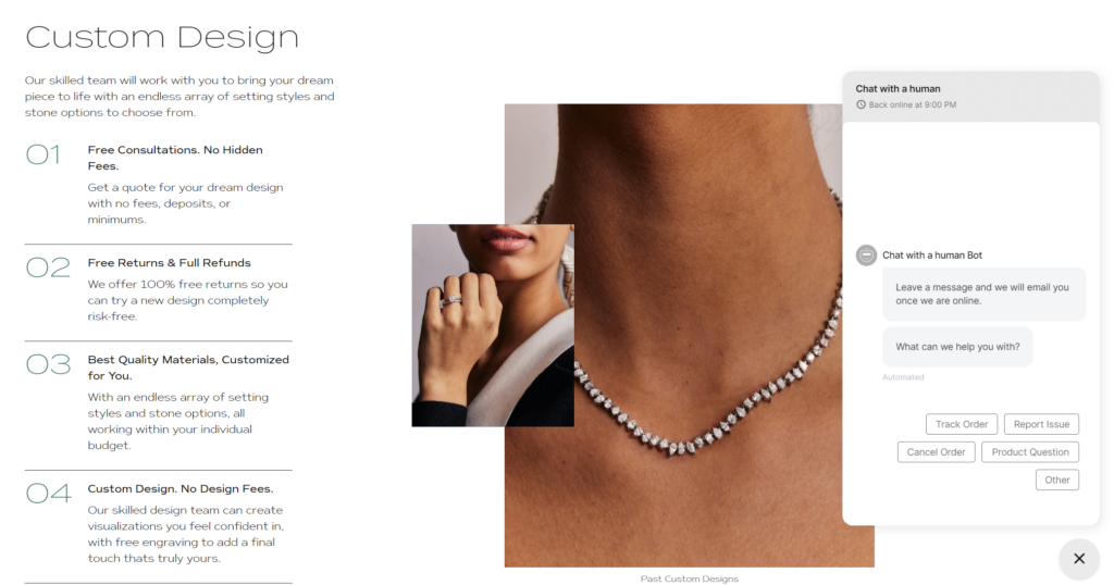
Furthermore, AI and chatbots can assist in managing inventory, predicting trends, and reducing cart abandonment rate by reminding customers of their unpurchased items.
Companies like Sephora and Noemie have successfully incorporated AI and chatbots to enhance their customer service and personalize user experiences. By 2024, we can expect more brands to follow suit and embrace these advanced technologies in their eCommerce designs.
Storytelling Approach for Product Pages
In 2024, one of the emerging trends in eCommerce design is set to be a ‘Storytelling Approach for Product Pages.’ This approach transforms a product page from a simple catalogue listing into a compelling narrative around the product. Rather than simply listing product specifications and features, storytelling invokes an emotional response in shoppers, encouraging them to make a purchase.
By providing behind-the-scenes insight into product development, showcasing real-life usage scenarios, or simply by creating a relatable context around a product, eCommerce businesses can elevate product presentations to a new level. This approach can boost product page performance, increase conversions, and ultimately, drive sales.
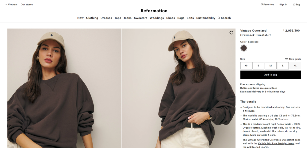
Brands like Palais De Tokyo and Reformation have already started implementing the storytelling approach in their product pages with positive outcomes. As we inch closer to 2024, expect this trend to become more widespread in the eCommerce domain.
Unconventional Page Filters
When it comes to online shopping, finding the right product can sometimes feel like searching for a needle in a haystack. This is where ‘Unconventional Page Filters’ come into play. These unique filter systems allow the users to narrow down their search based on various specific criteria, making the product search and selection process easier and more efficient.
In 2024, we predict a rise in the implementation of unconventional page filters in eCommerce design. These might include filters based on color swatches, customer ratings, ethical considerations like sustainably-sourced materials, or even emotional aspects like ‘mood’ or ‘feeling.’
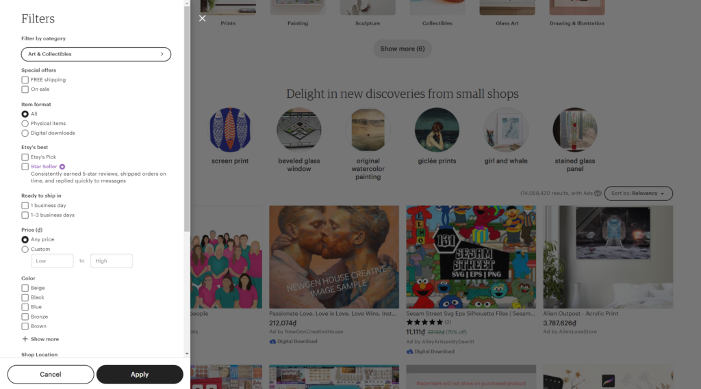
By using unconventional page filters, eCommerce websites can significantly enhance the user experience, making the browsing process more enjoyable and less overwhelming. Brands like Etsy and Anthropologie have successfully implemented unconventional filters in their design, providing a smooth, personalized, and effortless shopping experience to their users.
Conclusion
As we look towards 2024, the eCommerce industry continues to evolve, driven by changing consumer preferences, advancements in technology, and innovative design trends. From immersive web animations, interactive product visuals, and mobile-first design approaches to AI & chatbot features, the future holds exciting possibilities for eCommerce design.
Being ahead of these trends will not only help brands stand out in the increasingly competitive eCommerce marketplace but also create platforms that prioritize user experience, engagement, and conversion. By doing so, eCommerce businesses can build trust, retain customers, and ultimately, drive higher sales and growth in the future.
Whether you’re an eCommerce entrepreneur, a web designer, or simply interested in future trends, we hope this article has provided valuable insights into the future of eCommerce design. By understanding and implementing these trends, one can stay at the forefront of eCommerce innovations and be ready for what 2024 has in store!
