What is Bento Box Design and why is it trending?
Bento Box Design, a term borrowed from the Japanese art of compartmentalized lunchboxes, is making waves in the world of web design. This trend organizes content into neat, grid-based sections, creating a visually structured and user-friendly interface. But is it just another fleeting trend, or is it here to redefine how we experience the web?
At its core, Bento Box Design is about order and clarity. It takes inspiration from the Japanese bento box, where each compartment holds a distinct element, yet the whole comes together harmoniously. Similarly, this web layout trend divides content into clearly defined sections, making it easier for users to navigate and absorb information.
The rise of Bento Box Design can be attributed to its ability to solve a common problem in modern web design: information overload. With so much content competing for attention, a structured layout helps users focus on what matters most. It’s no wonder that platforms like Microsoft’s Fluent Design System and Apple’s app interfaces have embraced this approach.
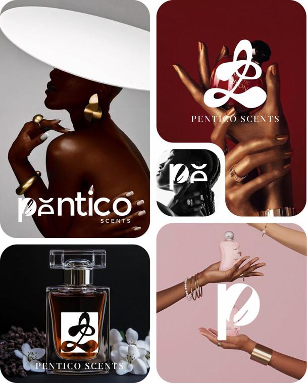
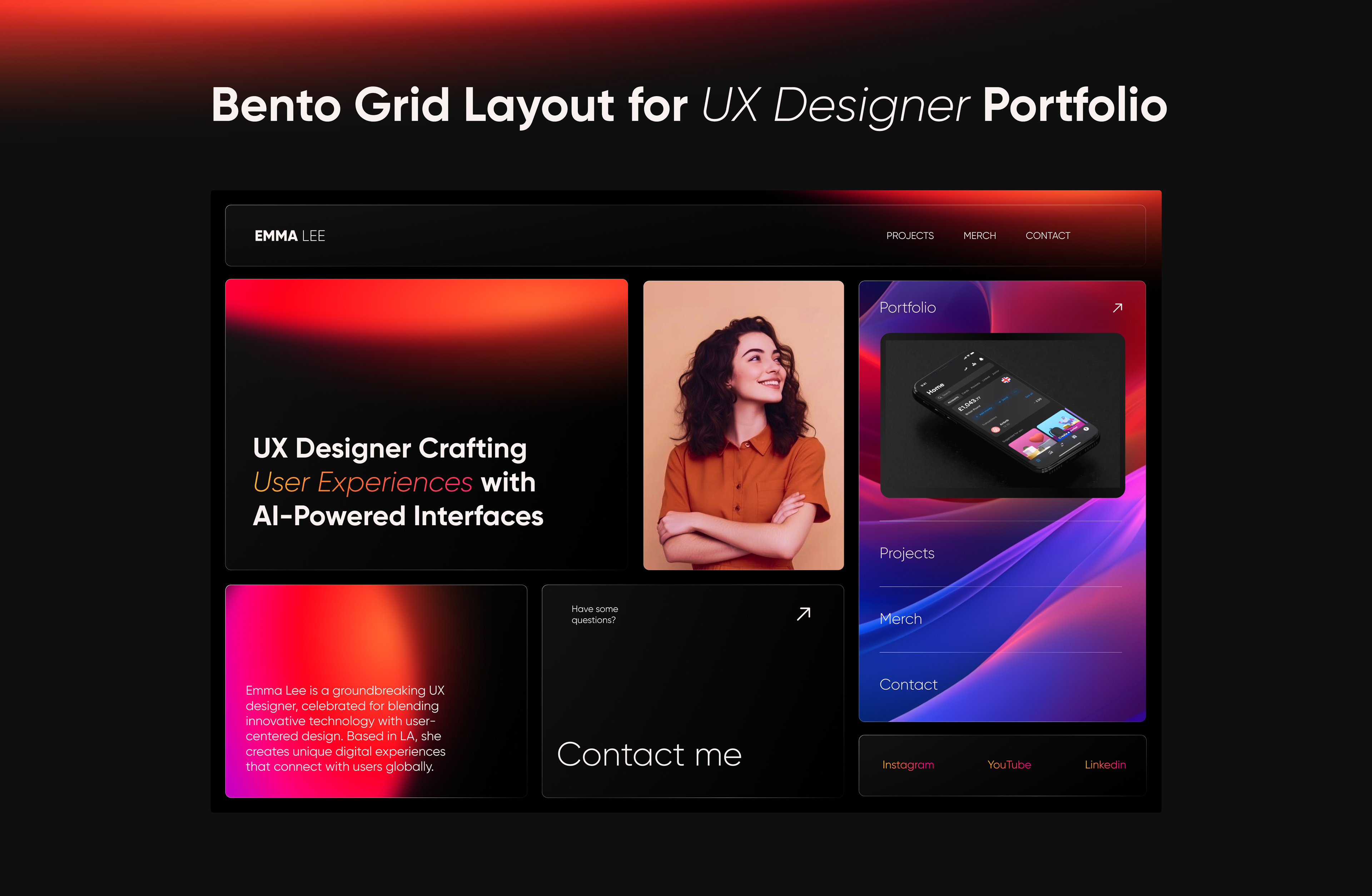
Bento grid. logo design by Rose opiyo
But here’s the controversial question: Is Bento Box Design truly revolutionary, or is it just a repackaging of existing grid-based layouts? Critics argue that it’s nothing new—designers have been using grids for decades. Yet, proponents claim that its compartmentalized approach offers a fresh perspective, blending aesthetics with functionality in a way that resonates with today’s users.
The trend’s popularity also ties into the broader shift toward minimalism and user-centric design. In an era where attention spans are shrinking, Bento Box Design provides a solution that’s both visually appealing and easy to digest. But does this mean it’s the future of web design, or is it simply a response to current user behavior?
As we dive deeper into the world of Bento Box Design, one thing is clear: it’s sparking conversations and challenging traditional design norms. Whether it’s a passing trend or a lasting innovation, its impact on the web design landscape is undeniable. So, is it time to embrace the bento box, or should we question its staying power? Let’s explore further.
The appeal of Bento Box Design: Why designers love it
Bento Box Design has become a darling of the design world, and for good reason. Its charm lies in its ability to balance creativity with structure, offering a framework that feels both liberating and disciplined. But what is it about this trend that has designers swooning? Let’s unpack the reasons behind its widespread appeal.
Simplicity meets versatility
At its heart, Bento Box Design is about simplicity. By dividing content into clean, grid-based sections, it eliminates clutter and creates a sense of order. This simplicity isn’t just visually pleasing—it’s functional. Users can quickly scan a page and find what they’re looking for without feeling overwhelmed.
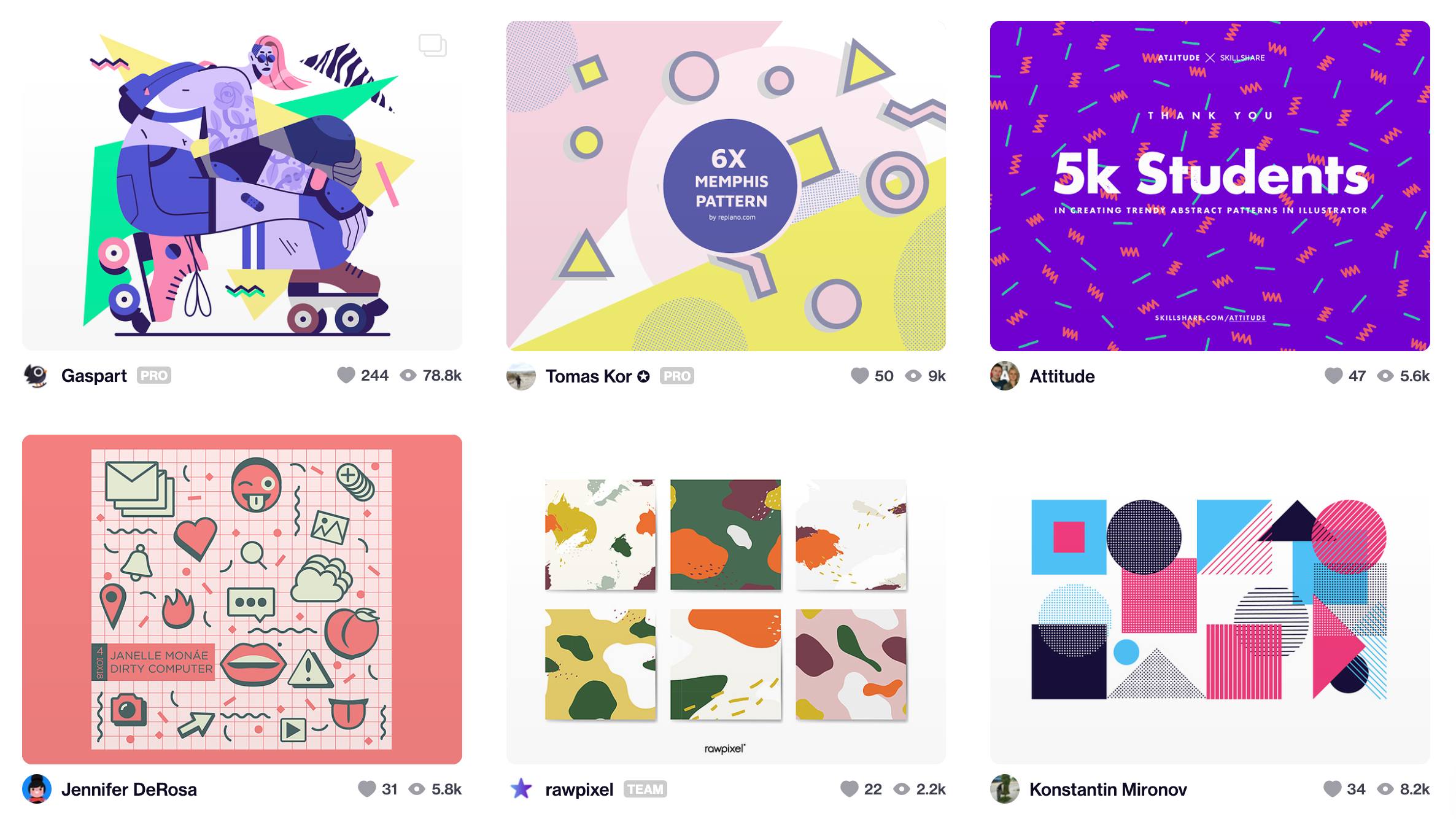
But don’t mistake simplicity for monotony. One of the most compelling aspects of Bento Box Design is its versatility. Designers can play with colors, typography, and imagery within each compartment, creating a dynamic and engaging experience. Whether it’s a portfolio, an e-commerce site, or a news platform, this layout adapts seamlessly to diverse content types.
Creative freedom within a framework
One of the biggest challenges in design is finding the sweet spot between creativity and usability. Bento Box Design solves this by providing a structured framework that still allows for artistic expression. Designers can experiment with asymmetrical grids, overlapping elements, or bold contrasts, all while maintaining a cohesive layout.
This balance is particularly appealing in a world where user experience (UX) is king. Designers no longer have to choose between aesthetics and functionality—Bento Box Design lets them have both.
Responsive by nature
In today’s multi-device world, responsive design isn’t just a bonus—it’s a necessity. Bento Box Design’s grid-based approach naturally lends itself to responsiveness. Each compartment can be easily resized or rearranged to fit different screen sizes, ensuring a consistent experience across desktops, tablets, and smartphones.
This adaptability is a major win for designers who are tired of wrestling with complex responsive layouts. With Bento Box Design, they can focus on creativity rather than troubleshooting compatibility issues.
A trend that aligns with user behavior
Let’s face it: modern users are impatient. They want information fast, and they want it presented in a way that’s easy to digest. Bento Box Design caters to this need by breaking content into bite-sized chunks. This approach not only improves readability but also encourages users to engage with the content.
Designers love this trend because it puts the user first. By prioritizing clarity and ease of use, Bento Box Design aligns perfectly with the principles of user-centric design.
The bottom line
Bento Box Design isn’t just a trend—it’s a tool that empowers designers to create beautiful, functional, and user-friendly interfaces. Its simplicity, versatility, and responsiveness make it a standout choice in a crowded design landscape. But as with any trend, it’s important to ask: Is it a one-size-fits-all solution, or are there limitations we need to consider? Let’s explore the potential downsides next.
The dark side of Bento Box Design: Is it overhyped?
While Bento Box Design has its fair share of admirers, it’s not without its critics. For all its sleekness and structure, this trend has sparked debates about whether it’s truly as revolutionary as it seems—or if it’s just another overhyped fad. Let’s dive into the criticisms and explore the potential downsides of this compartmentalized approach.
Rigidity and repetition: A creativity killer?
One of the most common complaints about Bento Box Design is its perceived rigidity. By dividing content into neat, grid-based sections, some argue that it stifles creativity. After all, how much can you really innovate within a framework that’s inherently structured?
Critics claim that this layout can lead to repetitive designs, where every website starts to look the same. The uniformity that makes Bento Box Design so appealing can also make it feel formulaic, leaving little room for unique storytelling or emotional engagement.
Overwhelming users with too much information
Another concern is that Bento Box Design can overwhelm users, especially when too much content is crammed into small sections. While the compartmentalized layout aims to simplify navigation, it can have the opposite effect if not executed thoughtfully.
Imagine a website where every square inch is filled with text, images, and buttons. Instead of feeling organized, it can feel chaotic, leaving users unsure of where to focus. This raises an important question: Does Bento Box Design prioritize aesthetics over functionality?
Aesthetic appeal vs. user experience
There’s no denying that Bento Box Design is visually striking. Its clean lines and symmetrical grids are a feast for the eyes. But does this come at the expense of user experience?
Some critics argue that the trend’s focus on aesthetics can lead to designs that look great but fail to serve their purpose. For example, a beautifully compartmentalized layout might sacrifice readability or make it harder for users to complete tasks. In the pursuit of visual perfection, are designers losing sight of what really matters—usability?
The risk of overuse
Like any trend, Bento Box Design runs the risk of being overused. As more and more websites adopt this layout, it could lose its novelty and become just another design cliché.
This raises an important point: Trends come and go, but good design is timeless. While Bento Box Design may be the flavor of the month, its long-term viability depends on whether it can evolve and adapt to changing user needs.
A middle ground?
Despite these criticisms, it’s worth noting that Bento Box Design isn’t inherently flawed—it’s all about execution. When used thoughtfully, it can strike a balance between structure and creativity, aesthetics and functionality.
The key is to avoid treating it as a one-size-fits-all solution. Designers should consider the specific needs of their audience and tailor the layout accordingly. After all, the best designs are those that prioritize the user, not the trend.
The verdict
Bento Box Design is undeniably appealing, but it’s not without its challenges. While it offers a structured and visually pleasing approach to web design, its rigidity and potential for overuse raise valid concerns. As with any trend, the real test lies in its ability to adapt and evolve.
So, is Bento Box Design overhyped? Perhaps. But that doesn’t mean it’s without merit. The question is: Can it rise above its limitations and prove its staying power? Let’s explore how it stacks up against traditional layouts in the next section.
Bento Box Design vs. traditional layouts: A comparison
The battle between Bento Box Design and traditional layouts is more than just a clash of aesthetics—it’s a debate about how we experience the web. On one side, you have the structured, grid-based approach of Bento Box Design. On the other, the storytelling-driven, free-flowing nature of traditional layouts. But which one comes out on top? Let’s break it down.
The case for traditional layouts: Storytelling and flow
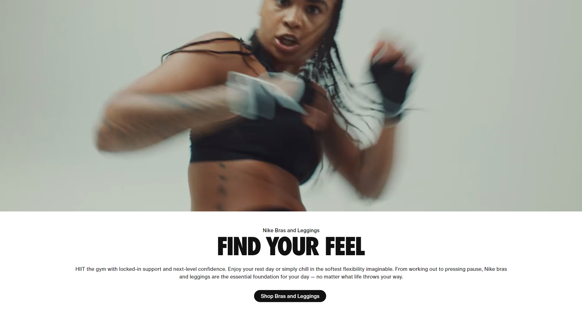
Traditional layouts have long been the backbone of web design, and for good reason. They prioritize storytelling, guiding users through a narrative with a clear beginning, middle, and end. This approach creates a sense of flow, making it easier for users to engage with the content on an emotional level.
For example, consider a long-form article or a brand’s “About Us” page. A traditional layout allows designers to weave text, images, and multimedia into a seamless experience, drawing users in and keeping them hooked. This fluidity is particularly effective for content that requires depth and context.
The rise of Bento Box Design: Structure and visual hierarchy
Bento Box Design, on the other hand, is all about structure. By dividing content into distinct sections, it creates a clear visual hierarchy that helps users navigate with ease. This compartmentalized approach is especially useful for websites with diverse content types, such as portfolios, e-commerce sites, or news platforms.
Take, for instance, a product page on an e-commerce site. Bento Box Design can neatly organize product images, descriptions, reviews, and related items into separate compartments, making it easy for users to find what they need. This structured layout is a boon for usability, but does it sacrifice emotional engagement?
Emotional engagement: Where traditional layouts shine
One of the criticisms of Bento Box Design is that it can feel cold and impersonal. While it excels at organizing information, it may lack the emotional resonance that traditional layouts offer.
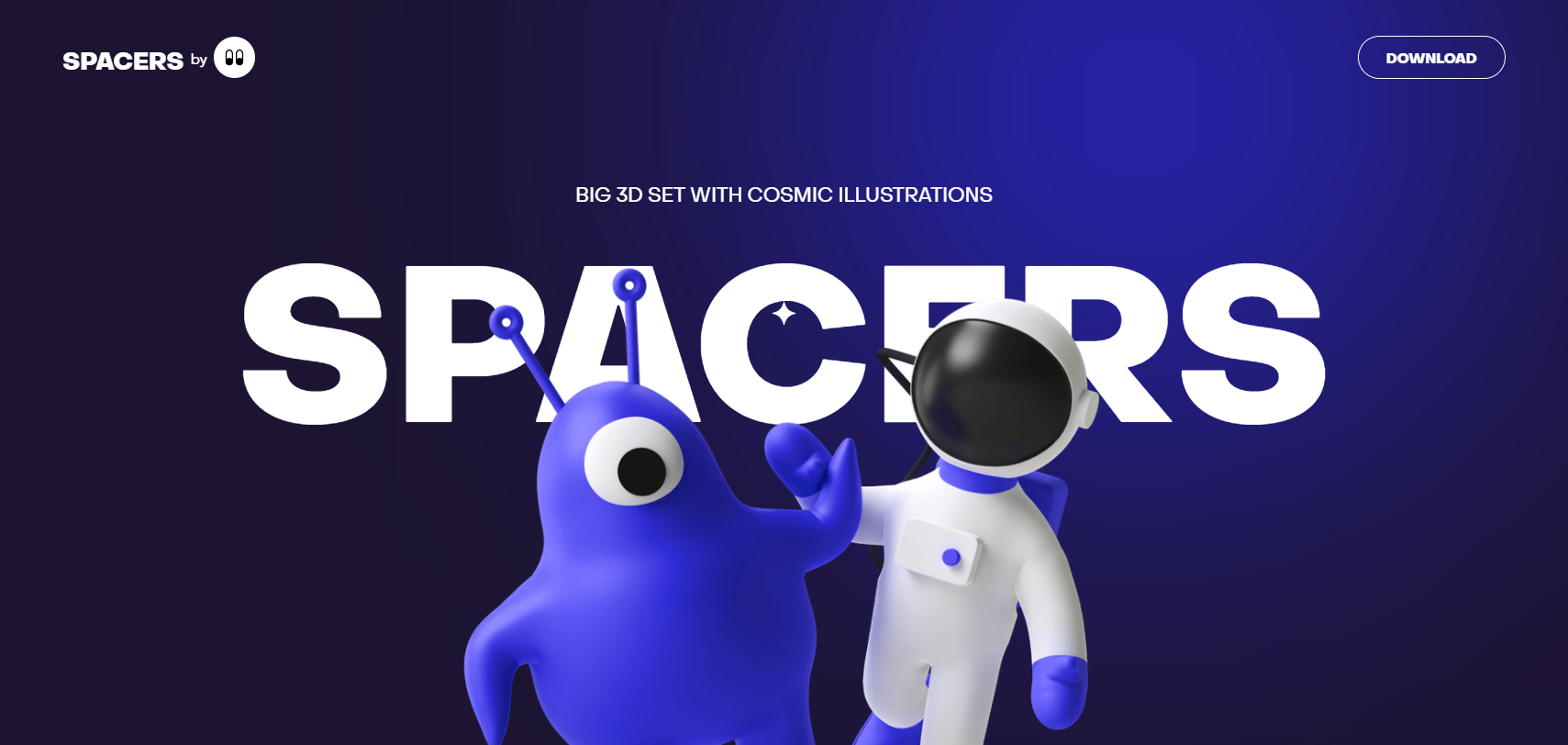
Traditional layouts allow for more organic, free-flowing designs that can evoke emotions and create a sense of connection. For example, a charity website might use a traditional layout to tell a heartfelt story, using imagery and typography to tug at the heartstrings. In contrast, a Bento Box Design might struggle to achieve the same level of emotional impact.
Usability vs. creativity: Finding the balance
So, where does that leave us? Traditional layouts excel in storytelling and emotional engagement, while Bento Box Design shines in structure and usability. But is there a middle ground?
The answer lies in hybrid approaches. Designers can combine the best of both worlds by using Bento Box Design for sections that require clarity and organization, while incorporating traditional layouts for storytelling and emotional depth.
For example, a travel website might use a Bento Box Design to showcase destinations in a grid-based format, but switch to a traditional layout for blog posts that tell the story of a traveler’s journey. This hybrid approach allows for both functionality and creativity, catering to different user needs.
The future of web design: A blend of both?
As we look to the future, it’s clear that neither Bento Box Design nor traditional layouts will dominate exclusively. Instead, the most successful designs will likely be those that blend the strengths of both approaches.
By combining the structure of Bento Box Design with the storytelling power of traditional layouts, designers can create experiences that are both user-friendly and emotionally engaging. The key is to understand the unique needs of each project and choose the approach—or combination of approaches—that best serves those needs.
The verdict
Bento Box Design and traditional layouts each have their strengths and weaknesses. While the former offers clarity and usability, the latter excels in storytelling and emotional engagement. The real challenge lies in finding a balance that leverages the best of both worlds.
So, is there a middle ground? Absolutely. The future of web design isn’t about choosing one over the other—it’s about creating experiences that are as functional as they are meaningful. Let’s explore whether Bento Box Design has what it takes to dominate in 2025.
Will Bento Box Design dominate web layouts in 2025?
As we inch closer to 2025, Bento Box Design is undeniably making its mark on the web design landscape. Its clean, structured approach has won over designers and users alike, but the question remains: Is this trend here to stay, or will it fade into obscurity like so many design fads before it? Let’s explore the factors that could determine its fate.
The case for Bento Box Design’s dominance
There’s no denying that Bento Box Design solves some of the most pressing challenges in modern web design. Its grid-based structure is a natural fit for responsive design, ensuring seamless compatibility across devices. In a world where mobile browsing continues to rise, this adaptability is a major advantage.
Moreover, Bento Box Design aligns perfectly with the growing demand for user-centric design. By breaking content into digestible sections, it caters to the short attention spans of today’s users. Its visual appeal and ease of navigation make it a strong contender for the go-to layout of the future.
The limitations that could hold it back
However, Bento Box Design isn’t without its flaws. Critics argue that its rigid structure can stifle creativity and lead to repetitive designs. While it excels at organizing information, it may struggle to deliver the emotional engagement that more fluid layouts offer.
Another concern is its potential for overuse. As more websites adopt this trend, there’s a risk that it could lose its novelty and become just another design cliché. If users start to feel that every website looks the same, the appeal of Bento Box Design could quickly wane.
The evolution of Bento Box Design
For Bento Box Design to remain relevant, it will need to evolve. Designers are already experimenting with ways to push the boundaries of this trend, incorporating asymmetrical grids, dynamic animations, and interactive elements. These innovations could help Bento Box Design stay fresh and engaging.
Additionally, hybrid approaches that combine Bento Box Design with traditional layouts could offer the best of both worlds. By blending structure with storytelling, designers can create experiences that are both functional and emotionally resonant.
The rise of the next big trend
Of course, the web design world is always evolving. New trends emerge, and old ones fade away. While Bento Box Design is currently in the spotlight, it’s impossible to predict what the next big trend will be.
Some designers believe that immersive, 3D experiences could be the future of web design. Others predict a return to minimalism, with a focus on simplicity and speed. Whatever the next trend may be, it’s clear that Bento Box Design will need to adapt to stay relevant.
The verdict: A trend with potential, but no guarantees
So, will Bento Box Design dominate web layouts in 2025? The answer is: It’s complicated. While it has the potential to become a lasting design staple, its success will depend on its ability to evolve and address its limitations.
Designers who embrace this trend should do so thoughtfully, considering the unique needs of their audience and the specific goals of their projects. By combining the strengths of Bento Box Design with innovative approaches, they can create experiences that stand the test of time.
What do you think?
The future of web design is in your hands. Do you believe Bento Box Design is the future, or is it just another passing trend? Share your thoughts in the comments below and join the conversation. Let’s shape the future of web design together!
