The practice of combining and arranging the visual elements of a project is known as graphic design. Graphic design includes everything from planning the layout of a magazine to developing a poster for a theater play to designing product packaging.
Graphic design is vital for communication and branding because it uses visuals to express messages, emotions, and ideals. It can also serve to draw attention, establish recognition, and improve the user experience.

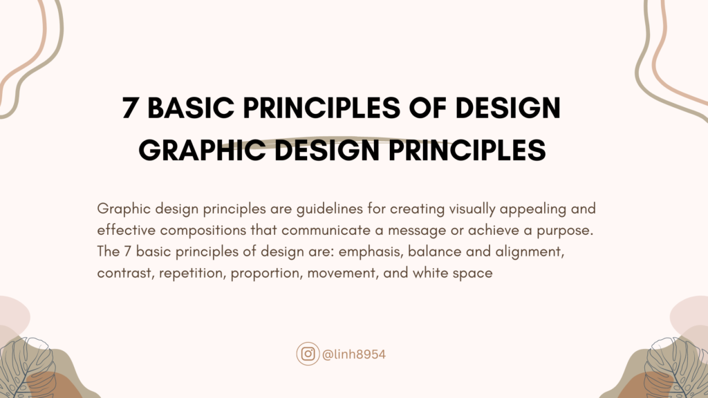
Graphic designers must adhere to some basic design rules in order to develop effective and appealing compositions. These principles serve as guidance for organizing and arranging the elements in a harmonic manner. Emphasis, Balance and Alignment, Contrast, Repetition, Proportion, Movement, and White Space are the basic design principles.
We are going to define the basic principles of graphic design and demonstrate how it can be used in graphic design tasks. We will also demonstrate some examples of designs that employ these ideas to produce visually spectacular results.
Emphasis – Principle of Graphic Design
Emphasis is the focal point of a design and the order of importance of each element within a design. It helps to draw attention to the most relevant or significant information or message in a composition. To create emphasis, graphic designers can use different techniques such as color, size, type, shape, or position. For example, they can use a bright color or a large font size to highlight a headline or a call to action. They can also use a different shape or position to make an element stand out from the rest.
Balance and Alignment principle
Balance is the distribution of the graphic design elements evenly throughout a layout. It is an important rule in principles of graphic design It helps to create a sense of stability and harmony in a design. There are three types of balance: symmetrical, asymmetrical, and radial. Symmetrical balance is achieved when elements on either side of a central vertical axis are basically the same. Asymmetrical balance is achieved when elements on either side of a central axis are not the same but still create an equilibrium. Radial balance is achieved when elements are arranged around a central point. Alignment is the visual connection between elements such as images, shapes, or text boxes. It helps to create a sharp and ordered appearance and to guide the eye movement of the viewer.To create alignment, graphic designers can use grids or guides to align elements along horizontal or vertical lines. They can also use different types of alignment such as left, center, right, top, middle, or bottom.
Contrast in Graphic design
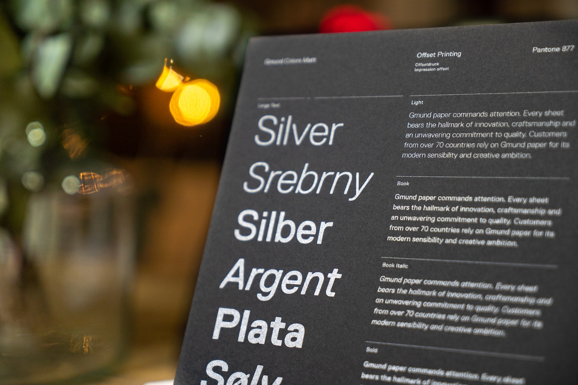
Contrast is the difference between elements that makes them stand out from each other. It helps to create interest, variety, and legibility in a design. To create contrast, graphic designers can use opposite or complementary colors, values, sizes, shapes, or types. For example, they can use a dark background and a light foreground, a large font and a small font, a round shape and a square shape, or a serif font and a sans serif font.
Repetition
Repetition is the use of the same or similar elements throughout a design. It helps to create consistency, unity, and recognition in a design. To create repetition, graphic designers can apply the same or similar colors, shapes, types, images, or patterns to different elements in a design. For example, they can use the same color scheme or font family for all the text elements, or the same shape or image for all the icons.
Proportion
Proportion is the relative size and scale of elements in a design. It helps to create balance, harmony, and emphasis in a design. To create proportion, graphic designers can use different techniques such as the golden ratio, the rule of thirds, or the Fibonacci sequence to determine the optimal size and placement of elements in a design. These techniques are based on mathematical formulas that create aesthetically pleasing proportions.
Movement
Movement is the illusion of motion or direction in a design. It helps to create dynamism, energy, and direction in a design. To create movement, graphic designers can use different techniques such as lines, shapes, colors, gradients, or animations to suggest motion or direction in a design. For example, they can use diagonal lines or arrows to indicate direction, curved shapes or gradients to indicate motion, or animations to show actual movement.
White Space
White space is the empty or negative space between or around elements in a design. It helps to create breathing room, focus, and contrast in a design. To use white space effectively, graphic designers can use different techniques such as grouping or separating elements, creating hierarchy or balance, or implying meaning or mood. For example, they can use white space to group related elements together or to separate unrelated elements apart. They can also use white space to create hierarchy or balance by leaving more space around important or dominant elements. They can also use white space to imply meaning or mood by creating a sense of openness, simplicity, or elegance.
In sumerize, the 7 basic principles of graphic design are essential tools for creating effective and attractive compositions. By using these principles, graphic designers can organize and arrange the elements in a harmonious way and communicate their messages clearly and effectively. We hope this article has helped you understand what each principle means and how it can be applied in graphic design projects. We encourage you to experiment with different combinations and applications of the principles in your own designs and see how they can improve your work.


